Design Project:
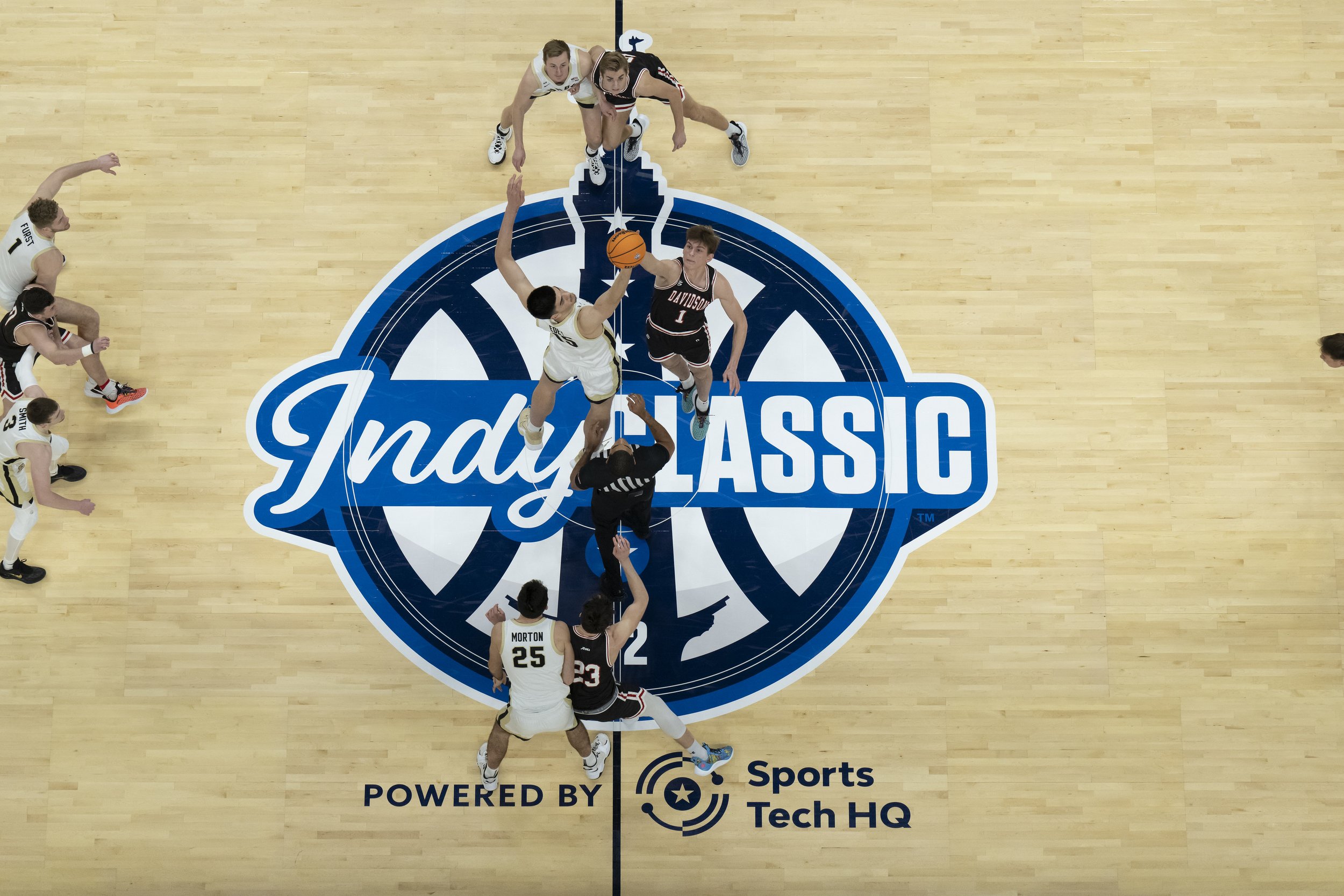
Indy Classic 23
This project was a lot of fun for me, despite the ups and downs of life happening around this time. I really got inspired by the current trend of using real photos mixed with modern design styles in today’s sports world.
INSPO
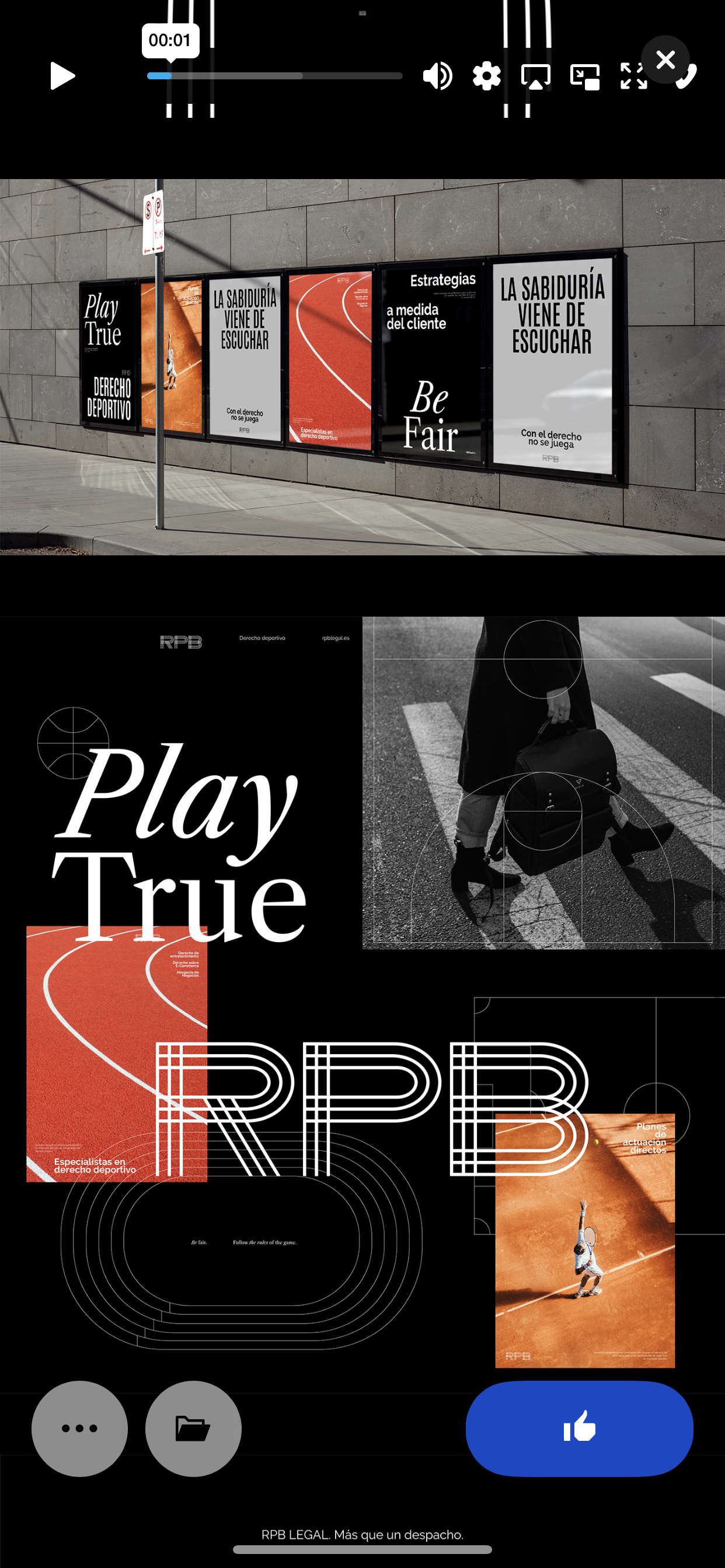

I was very inspired by the significant movement, minimalism of the words, and playfulness of the designs. I tried to replicate this in my work below. The inspiration phase came before and after my sketches, so some don’t reflect the images above.
SKETCHES


I started by writing out the sizes and necessary content of each design that was needed. From there, I tried to brainstorm different layouts and ideas. This part of the process can be difficult for a few reasons, but this time, I found it difficult because the sizes I was drawing weren’t the right proportion of the actual image/object that would be placed on the artboard. So, when I started to transfer my ideas, things didn’t work out quite as I hoped. However, it turned out to be a good thing because it brought me back to the inspiration phase, where I decided to dive deeper into using the player images and playing more with the layout.
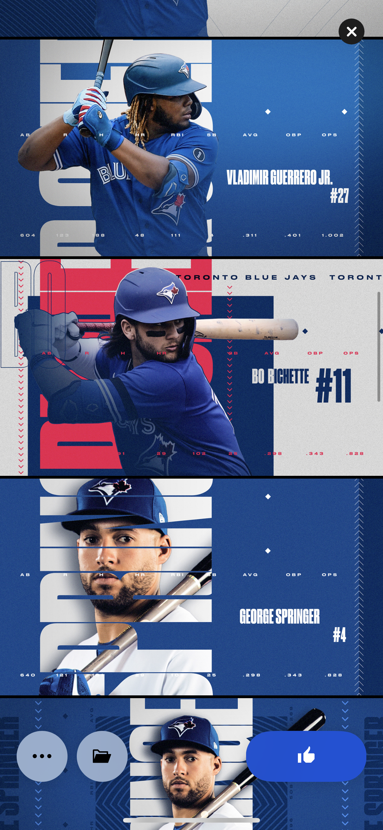
WEB ADS


I kept these looking very cohesive. With my past work from the Indy Classic, I knew that all web ads were kept the same, with a different emphasis on different things depending on where the web ad would end up or its purpose. Without knowing the purpose or where these were going, I emphasized ticket sales while still keeping the movement with the players. I also added a texture in the background of “Indy Classic” - I wasn’t sure if the same slogan would be used this year of “Indiana’s Newest Basketball Tradition.”
GAINBRIDGE FIELDHOUSE BANNER
I really emphasized the ticket sales compared to last year’s to help drive the sales when this goes up a few weeks before the event. I decided to take it vertically since your eye is already reading “Gainbridge Fieldhouse” vertically below it. It also helps give it as much real estate as possible since the banner is relatively narrow. From there, I incorporated the images to help the viewer know immediately that the event is basketball-related before they even get a chance to read anything.


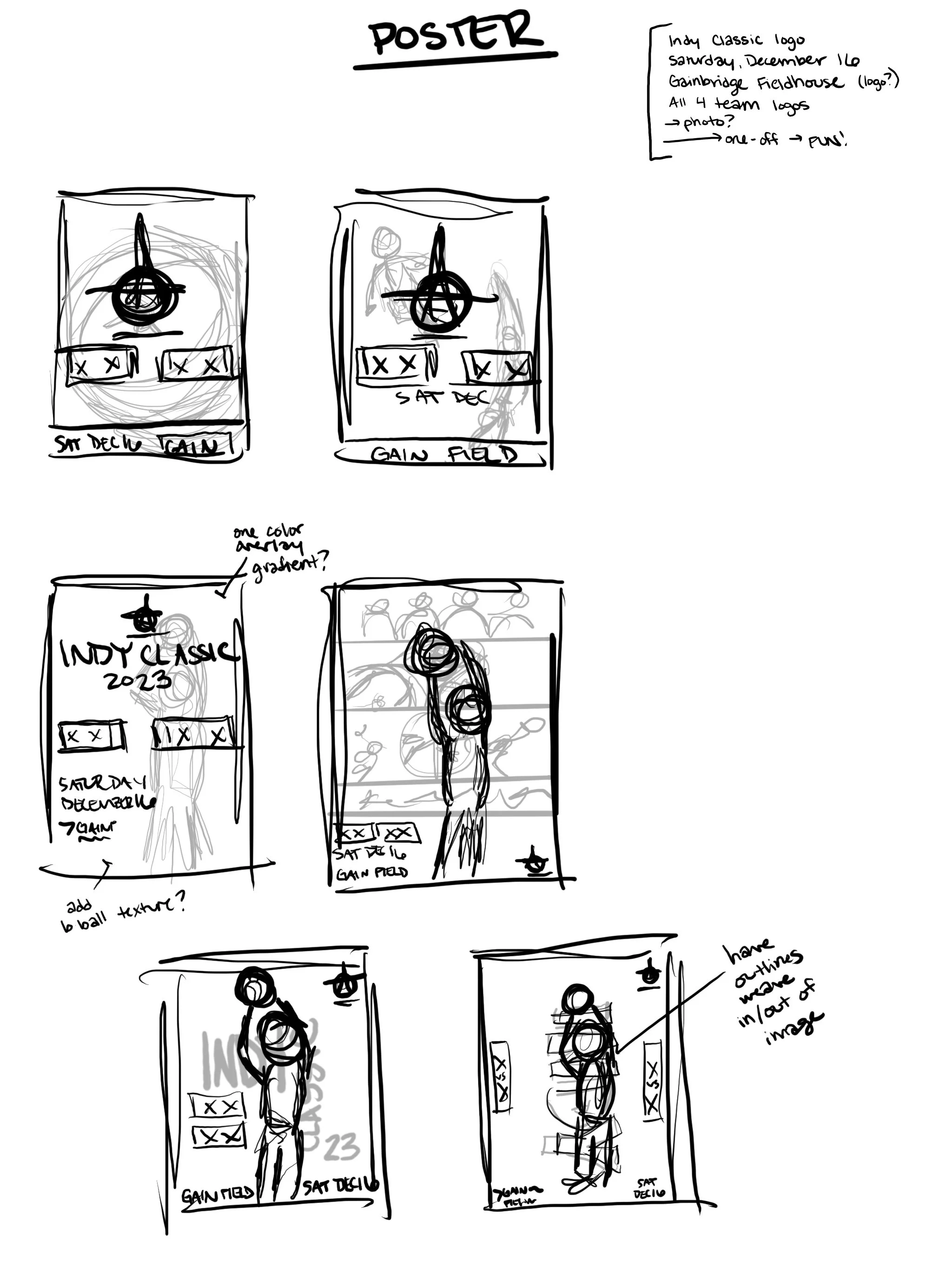
POSTERS
I know I was only supposed to create one poster, but these were too fun to make only one. I explored a few different styles. I also tried to channel my inner child and think about what I would be excited to take home and hang up in my room after the event.
MOTION GRAPHIC
I emphasized the motion on the ticket sales since that is the focus and the attention-grabber. I wanted to keep everything else static so people would always have that part of the information.