Senior Capstone:
The Florida Smash
For my senior capstone, we had a ton of freedom. The only guidelines were the number and quality of deliverables we had at the end of the semester. So I could really pick anything that I wanted, within reason. I knew I wanted to stick to the theme of sports, but with a fun twist, that would keep me interested through the whole semester. Thus, the rebrand of the Florida Smash Premier League Pickleball Team.
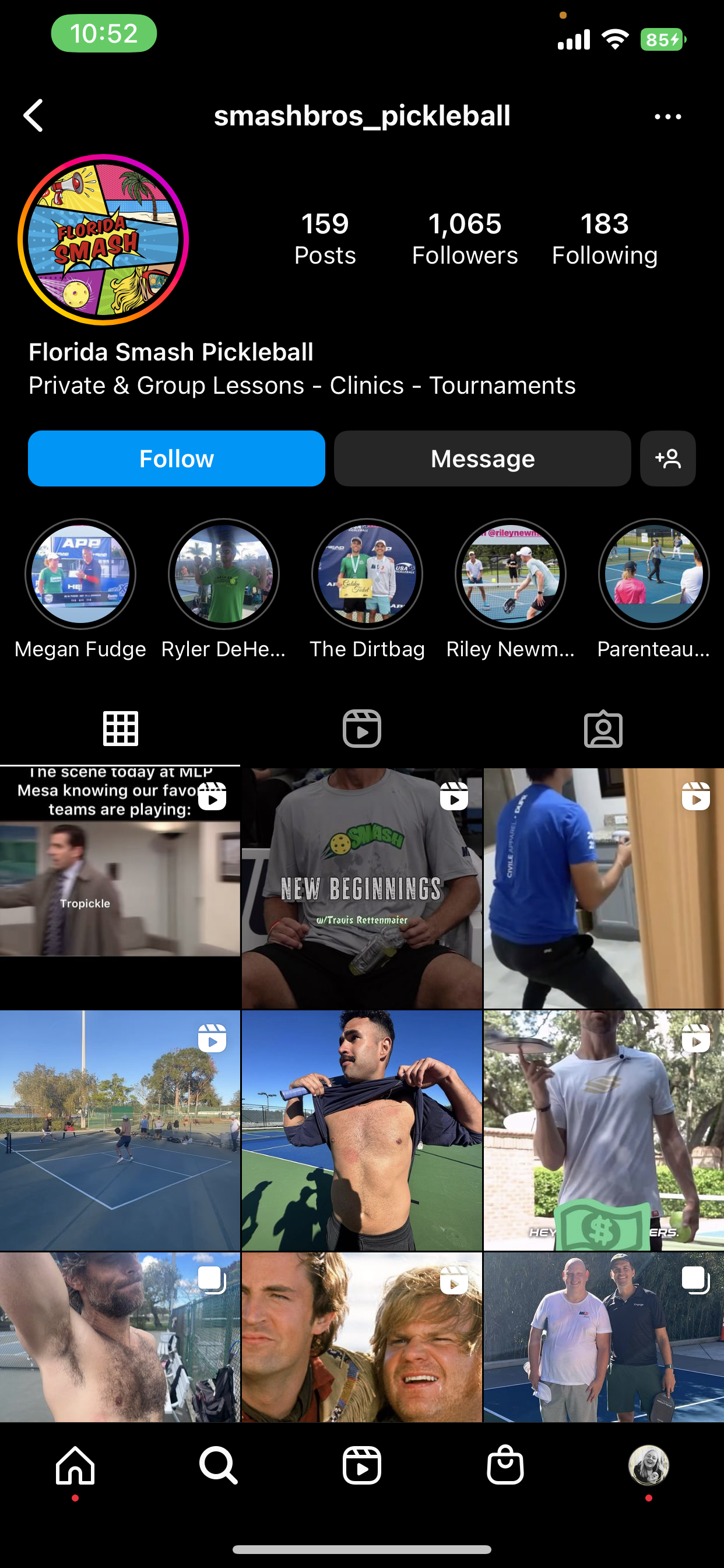
BEFORE
It’s a sad excuse for a Premier League Pickleball Team logo and Instagram. The sad thing was that they weren’t the only lousy logo to choose from. I don’t know about the other teams’ social media, but it looks like Florida Smash’s Instagram belongs to a teenage boy, not an official Pickleball team. My goal was to help bring new life to this team and create a cohesive brand, logo, social media, merch, and graphics - to help interest multiple generations and stand out against the other teams in the league.
AFTER
I tried to keep a more “old-school” feel with the color choices. That helps it feel nostalgic and like you’ve known and loved the team for years. I also created movement from what looked like a meteor about to hit Florida into a nice flow of an abstract explosion from the word “smash.” I also designed it so the abstract explosion could be a standalone second logo without the name in it.
Socials
Here is my final rebrand of some of their Instagram feed. I tried to balance real and designed photos, keeping them clean and exciting for the viewer. I also mocked up what a website could look like for them, holding to the fun new brand colors and spunkiness.
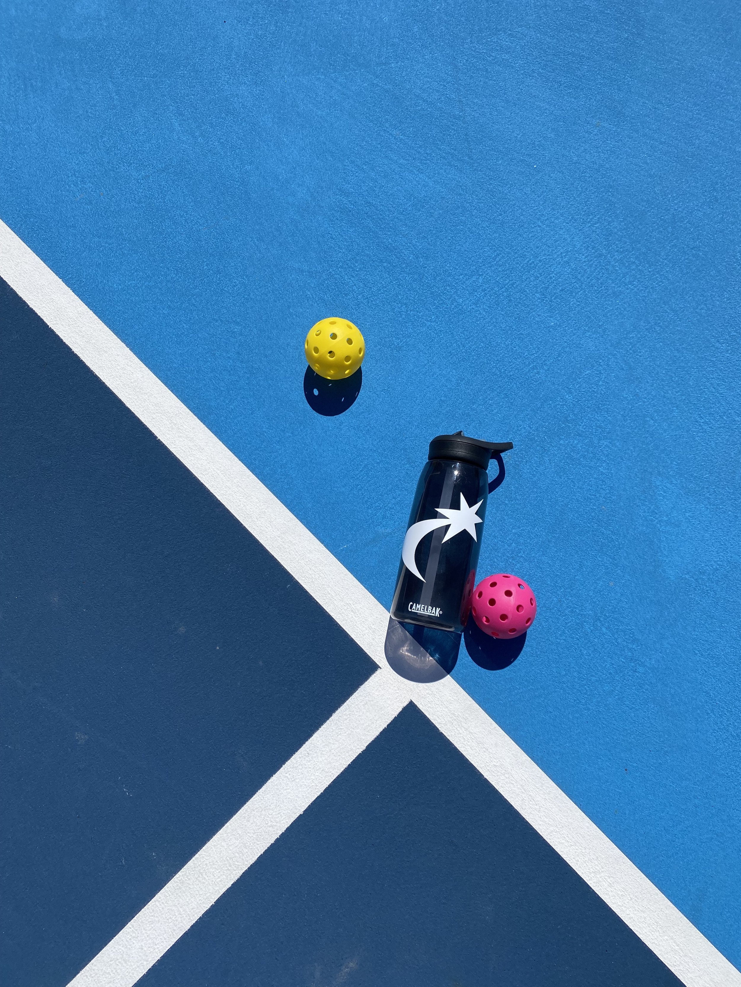
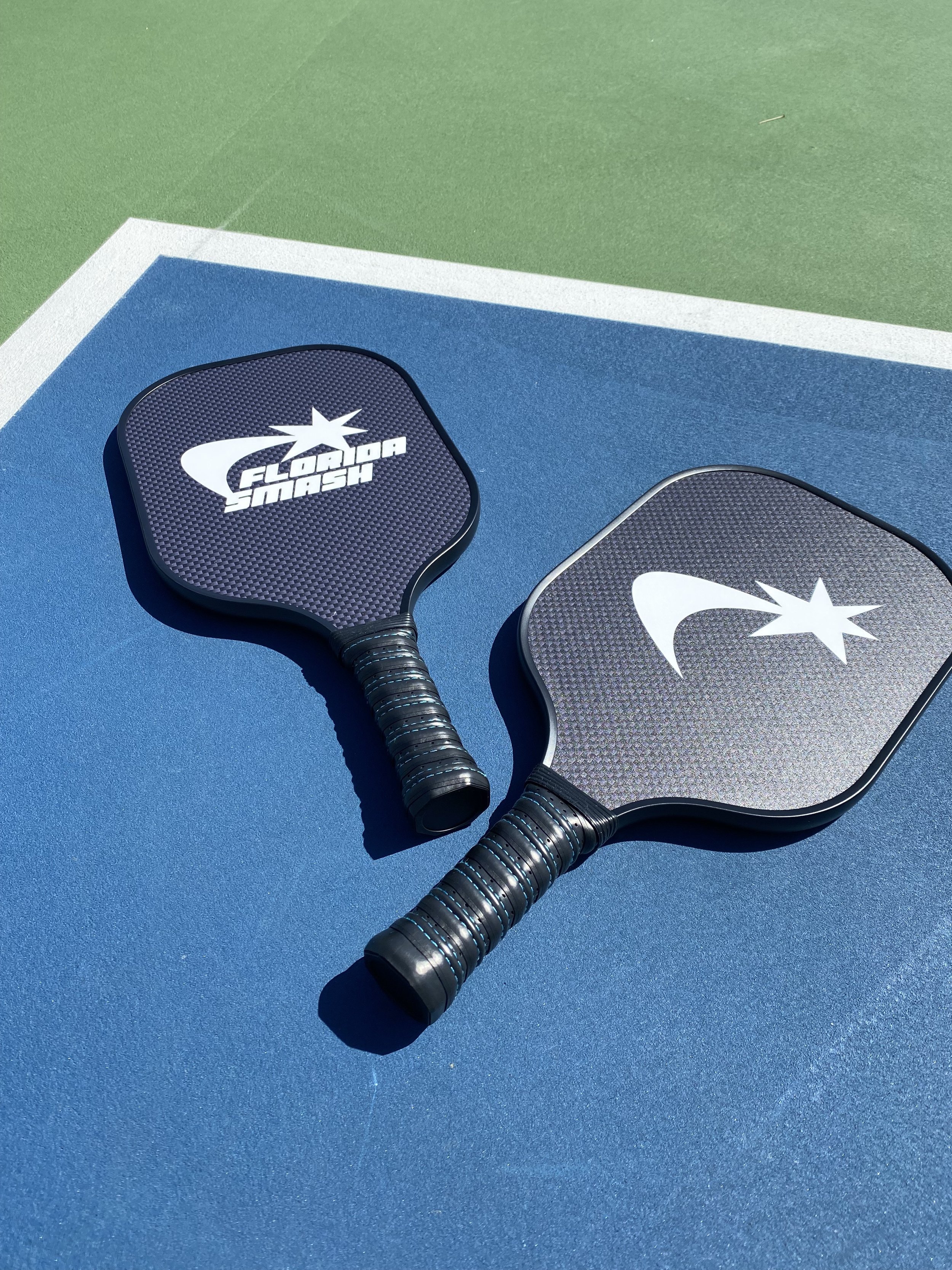
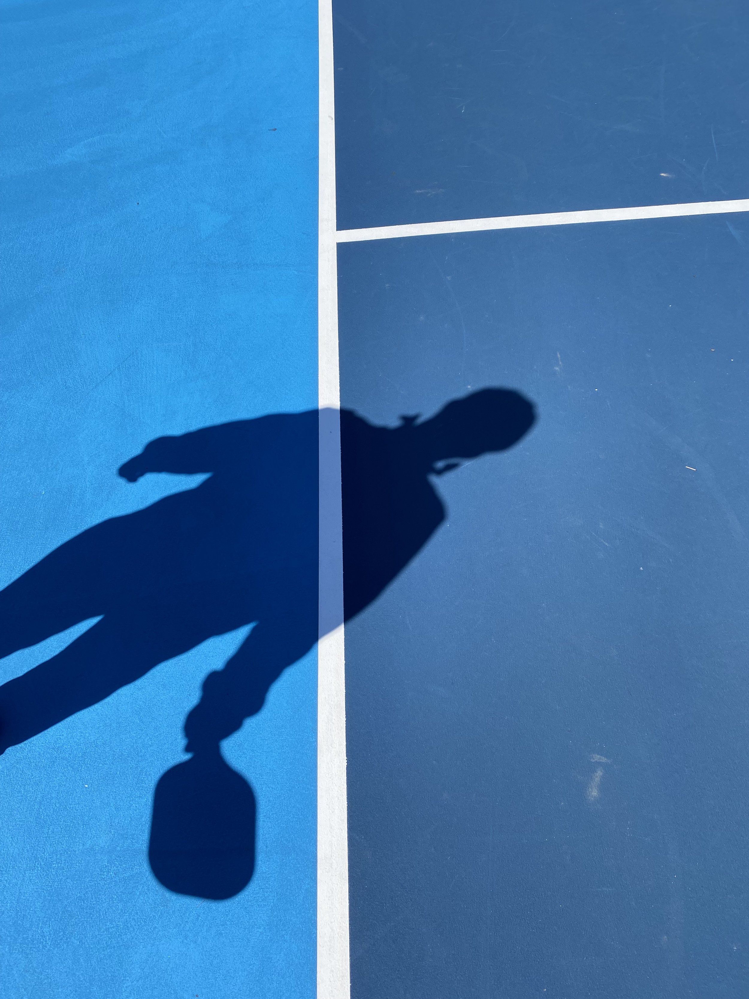
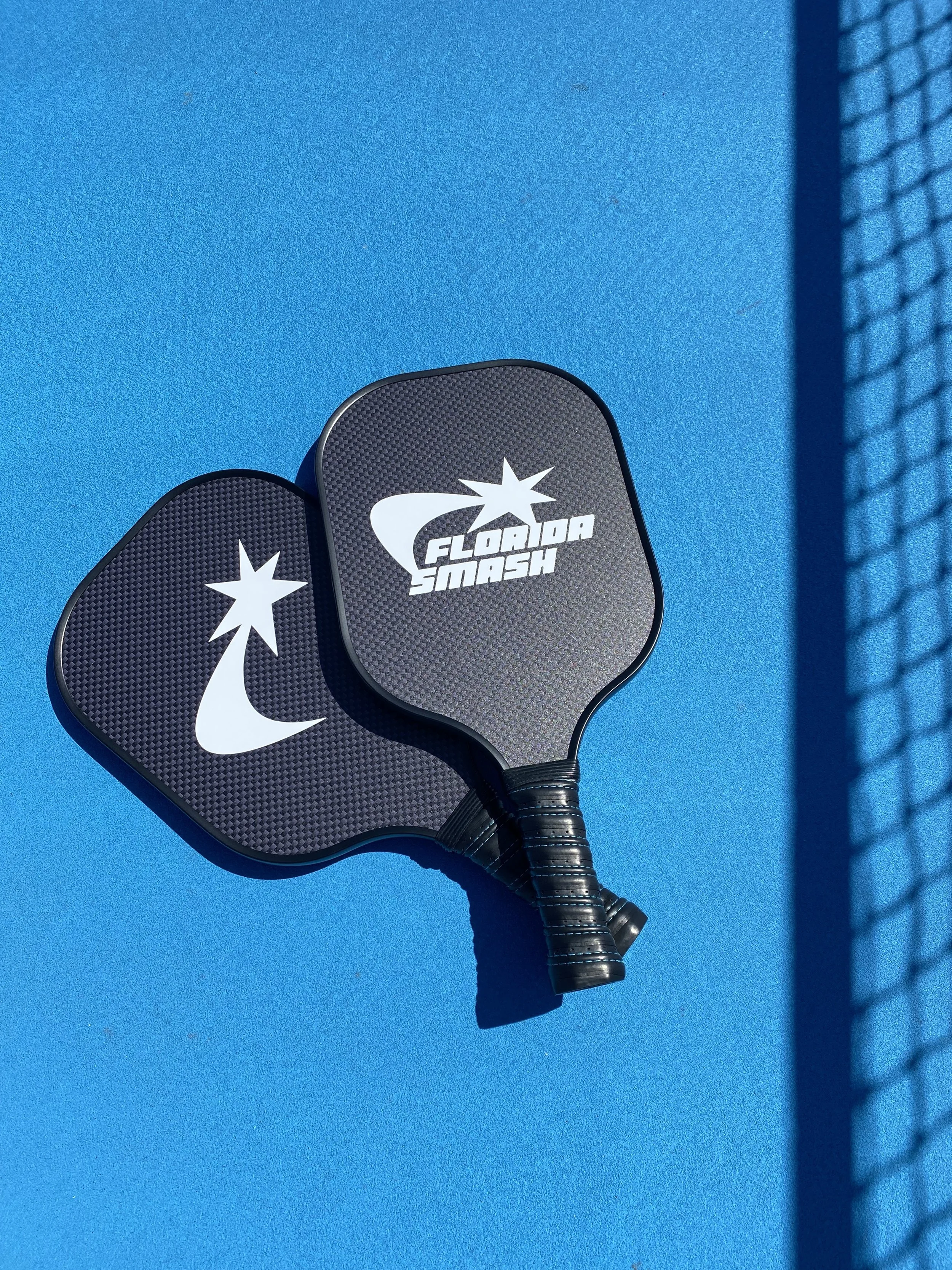
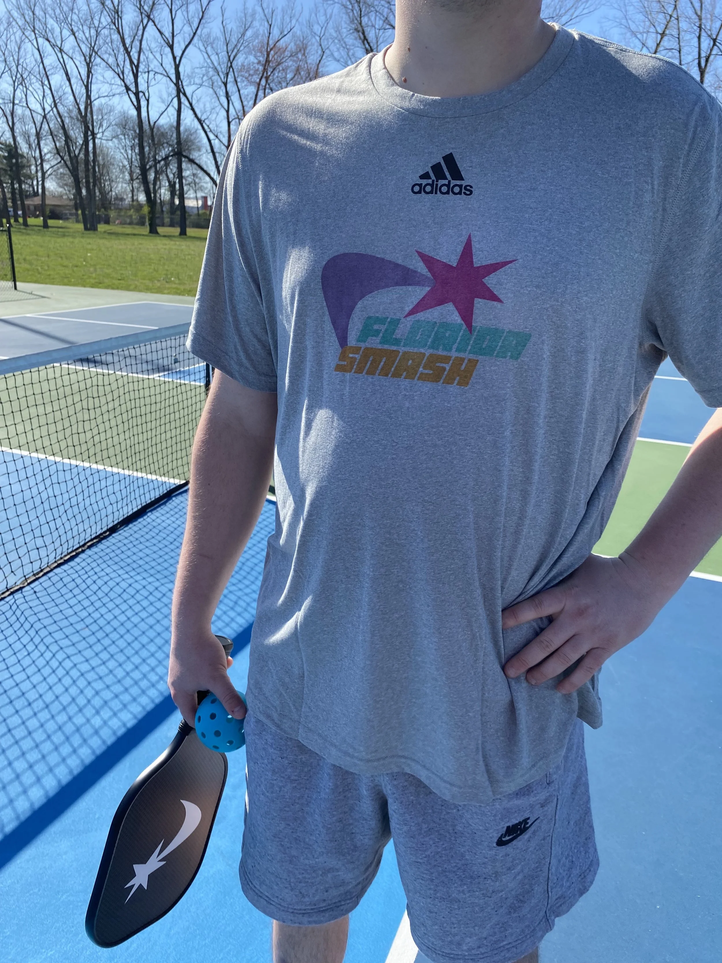
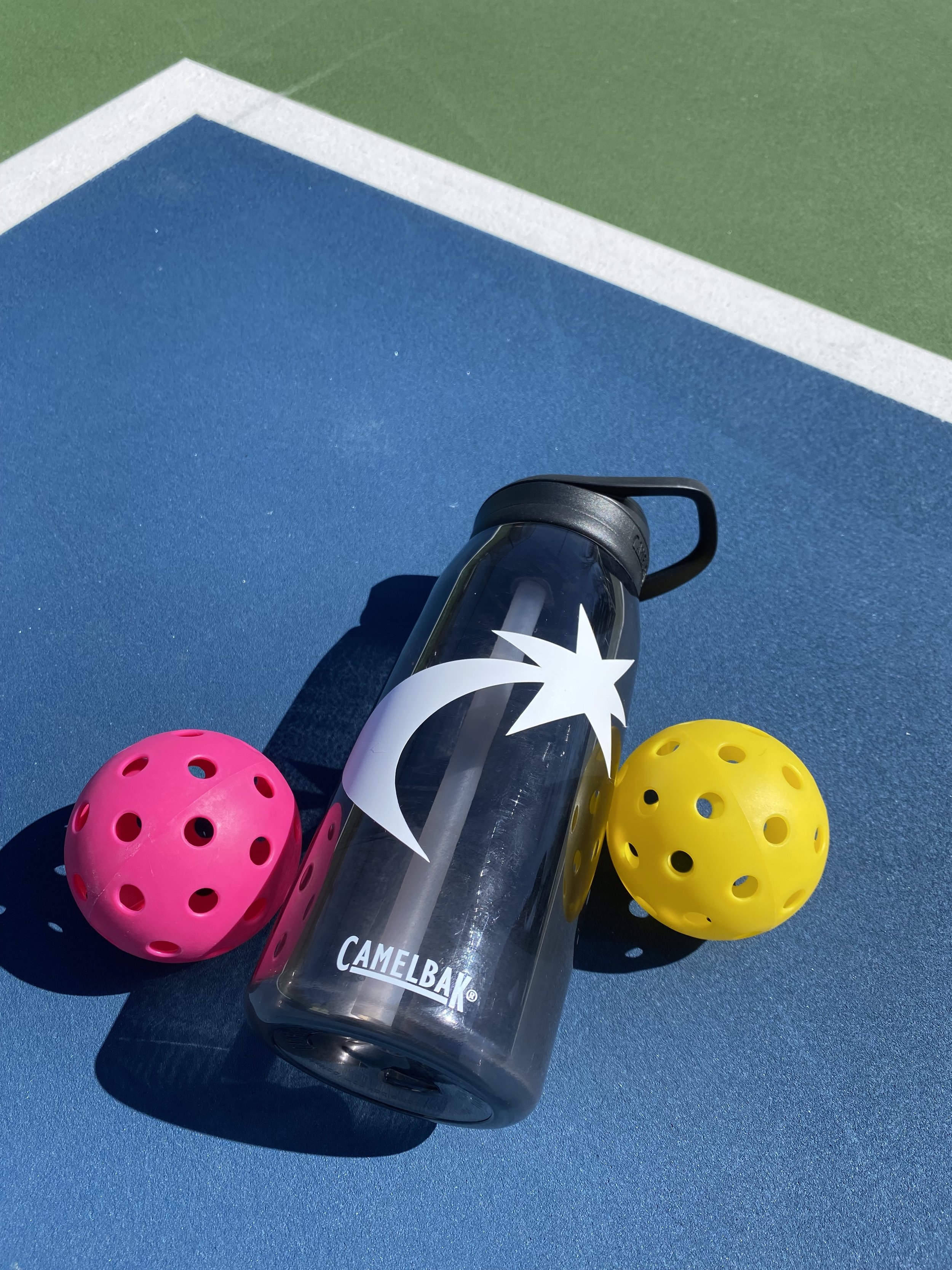
These are a few photos I took as assets for the project and to help get real-life mock-ups of some of my deliverables.




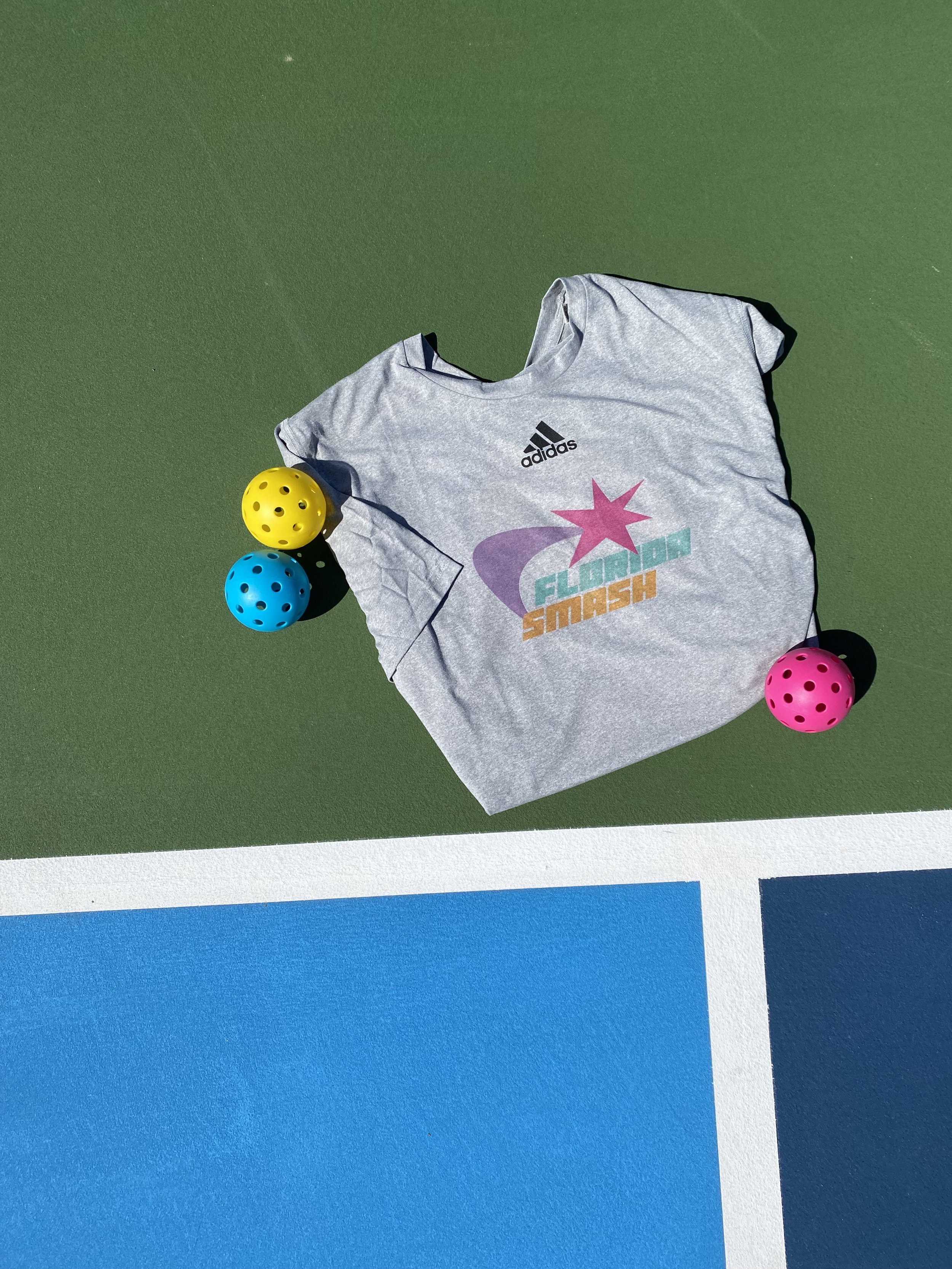
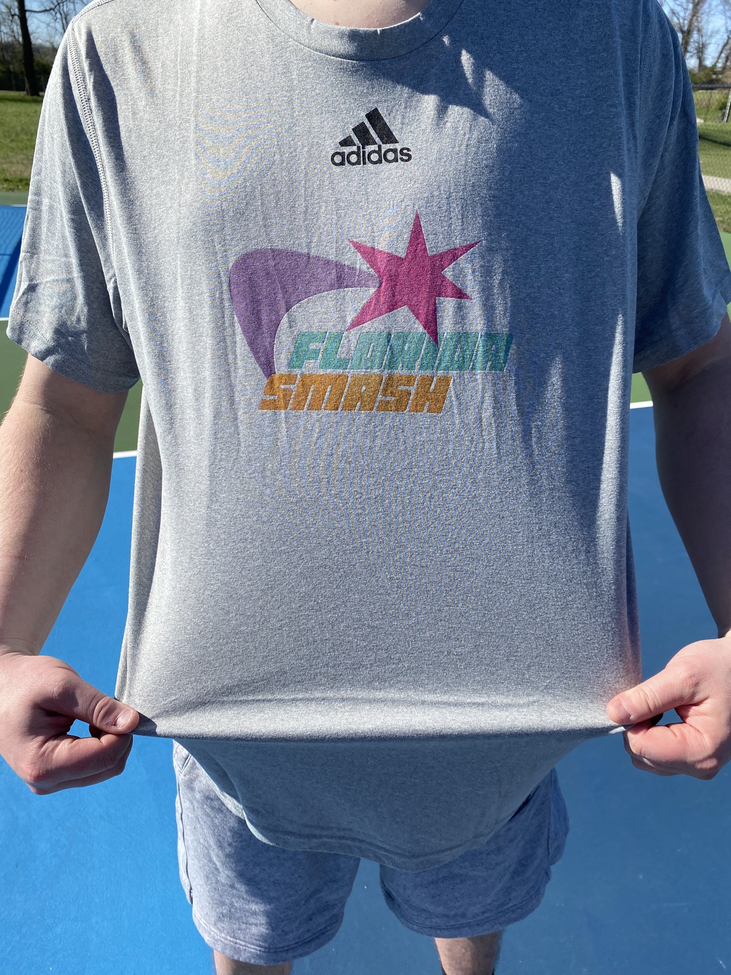
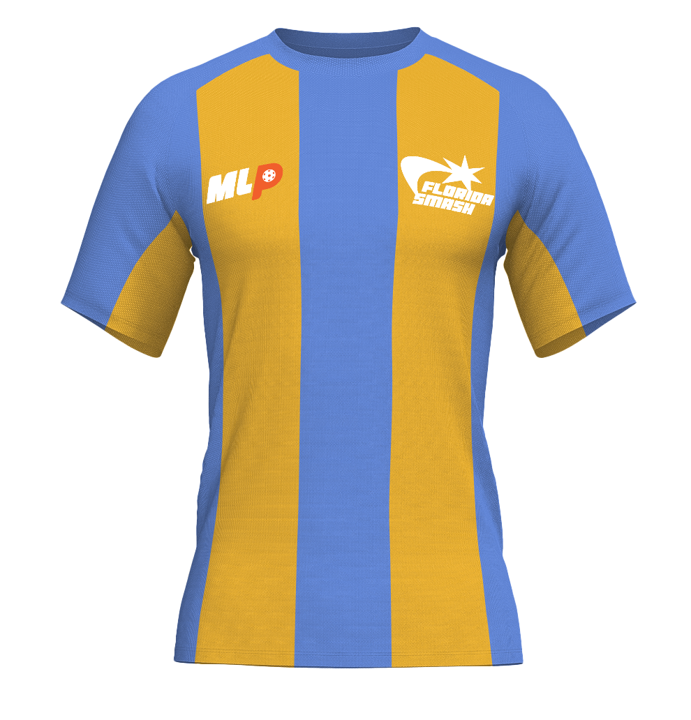
Jersey and Court
Mock-up
Motion Graphic
This is the final poster size that we got to lay out with all of our main deliverables for our project to present at our Capstone Exhibition back in May. We only had to keep the top bar and for the rest, we had free reign to design as we pleased, whether we wanted to just use it as branding, a singular mock-up, etc. I decided to lay everything out on mine since most of it is mock-ups that aren’t physical items. In addition to this poster, I had my iPad set out playing my motion graphic, along with stickers for the Florida Smash that was the logo and some personal branding stickers that were free to take!


