Olympics! Woo!
This project was a fun one! Each student was given a random city for which they had to rebrand the entire Olympics. This included research on the city’s architecture, what sport they’re most known for, etc. I did a deep dive into the city of Delhi. My professor was from India and helped me keep in line for what the culture would find recognizable.

For the logo-mark, I played around with the word “Delhi” in Hindi to make an abstract form. My professor helped me make sure it was illegible, as I definitely don’t know how to read or speak the language.
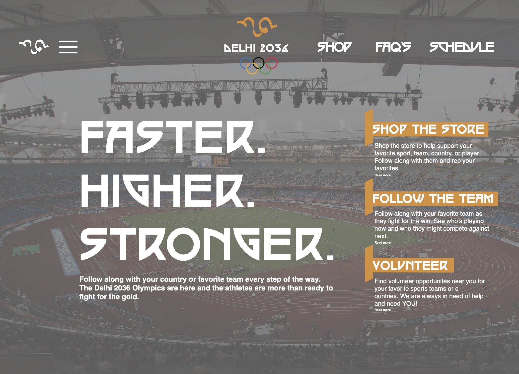
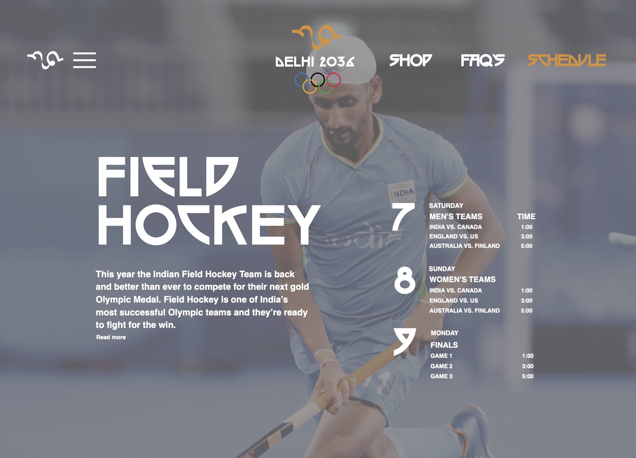
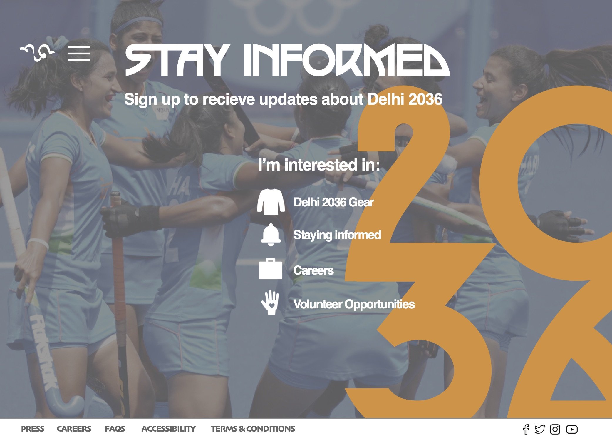
We made a poster, program, lanyard, and website for the whole project, and I’m proud of my consistency with the brand I created and the entire flow of my design.


I learned that Delhi is mainly known for its field hockey! I had fun incorporating type and image with dynamic photos of the field hockey players.
Here’s the inside and outside of the program. It’s meant to be folded up into a square for portability.
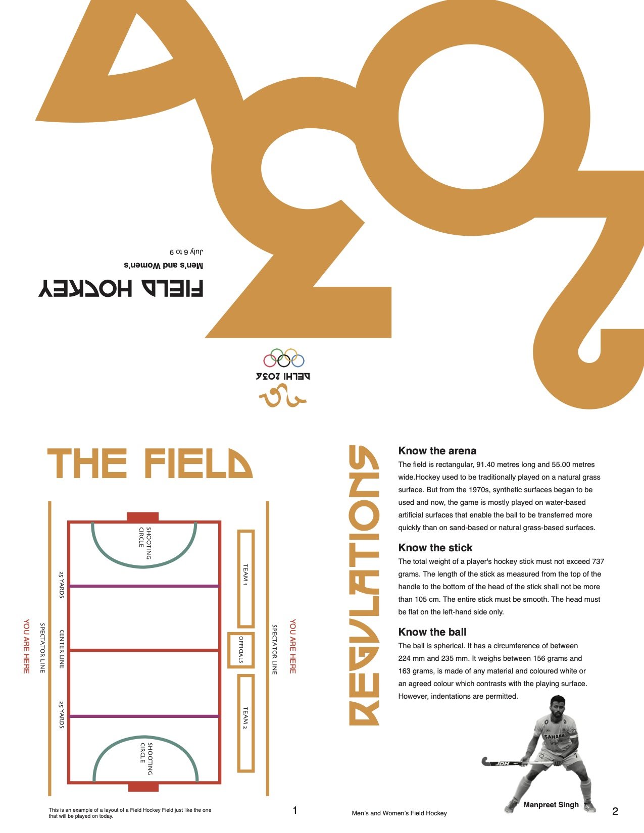
Outside
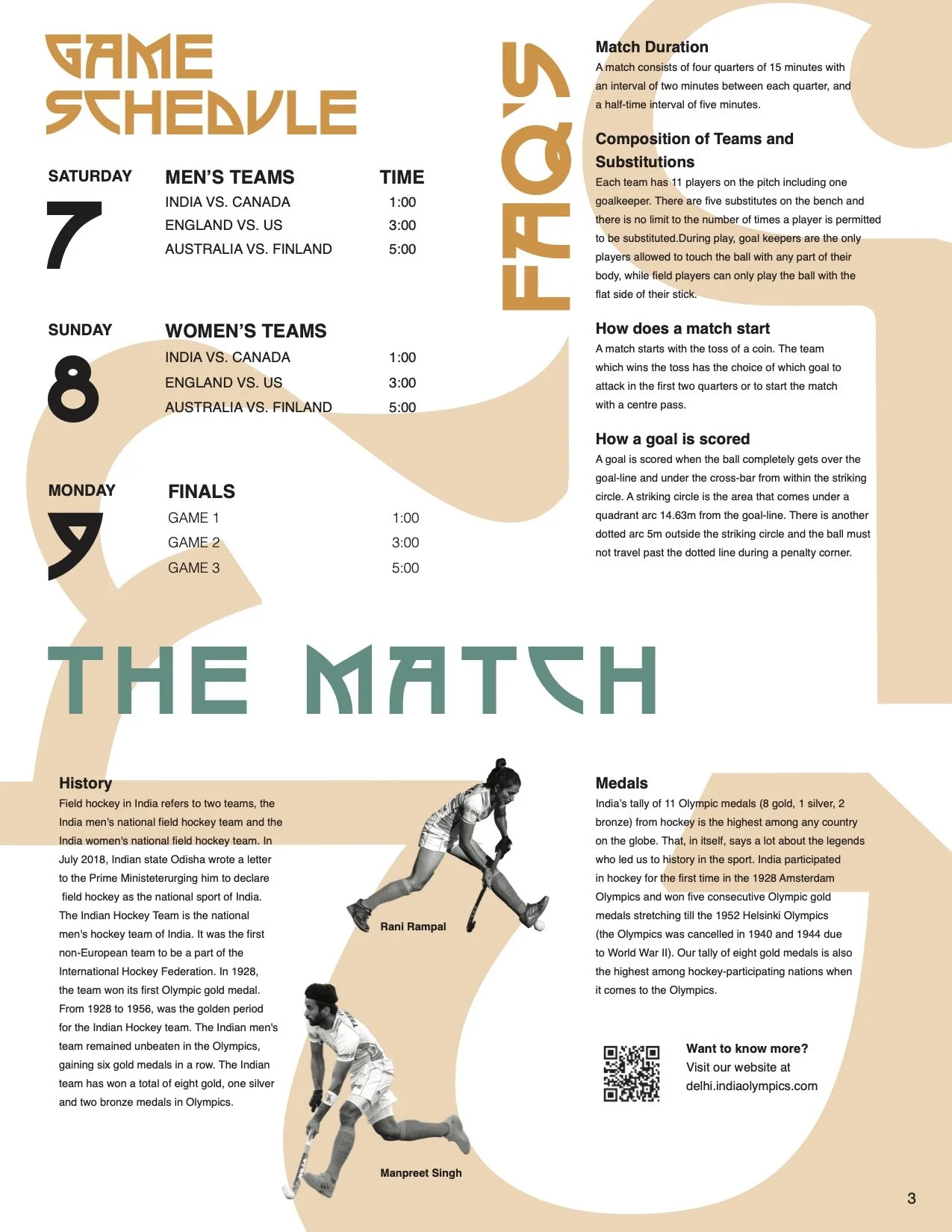
Inside
Here is the lanyard followed by my website screen mock-ups.