Legos!
We were told to choose any NPR article and make two magazine spreads and a poster on them. So why not have a little fun and choose one about legos? Seems like a no brainer to me.
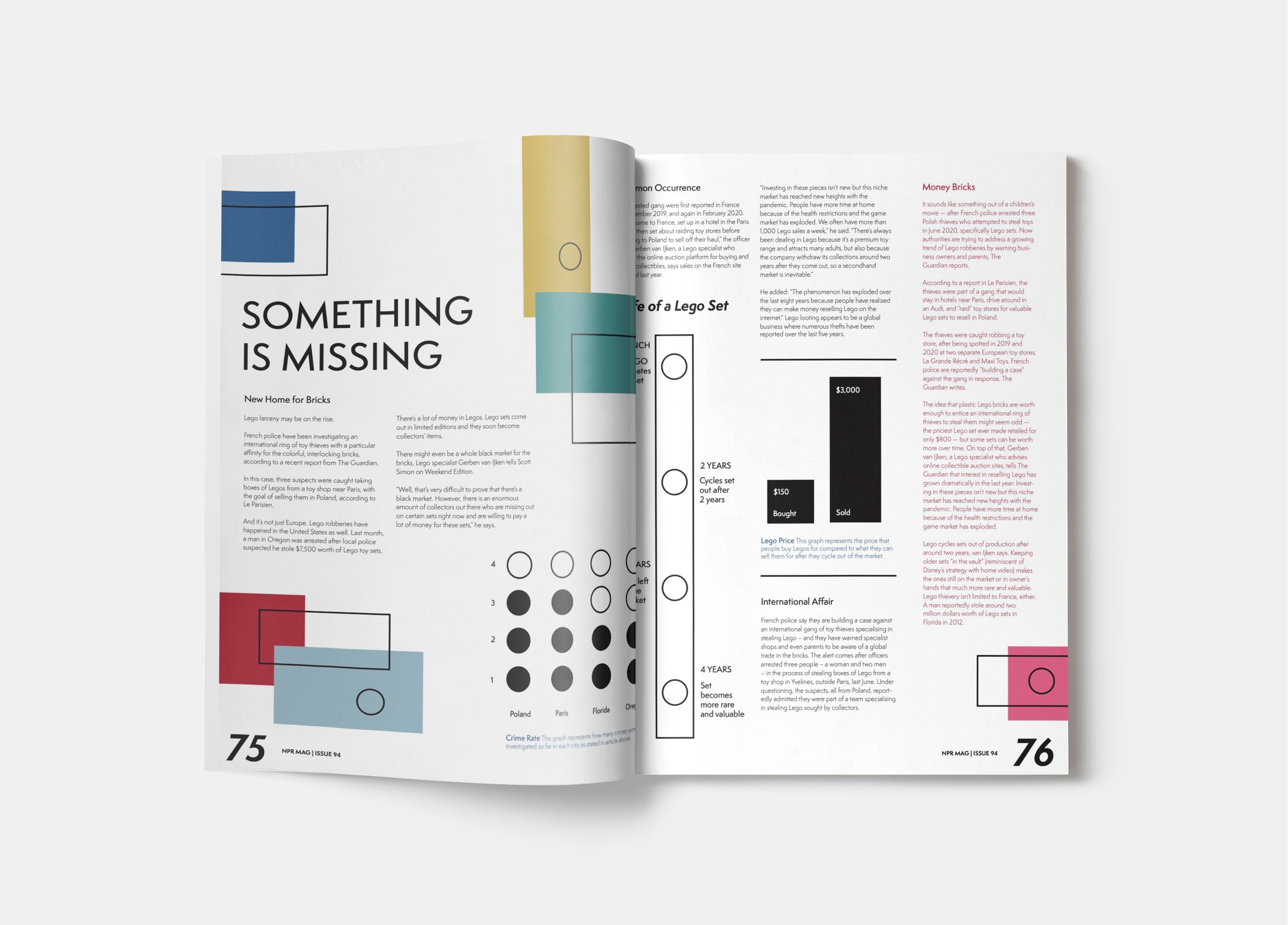
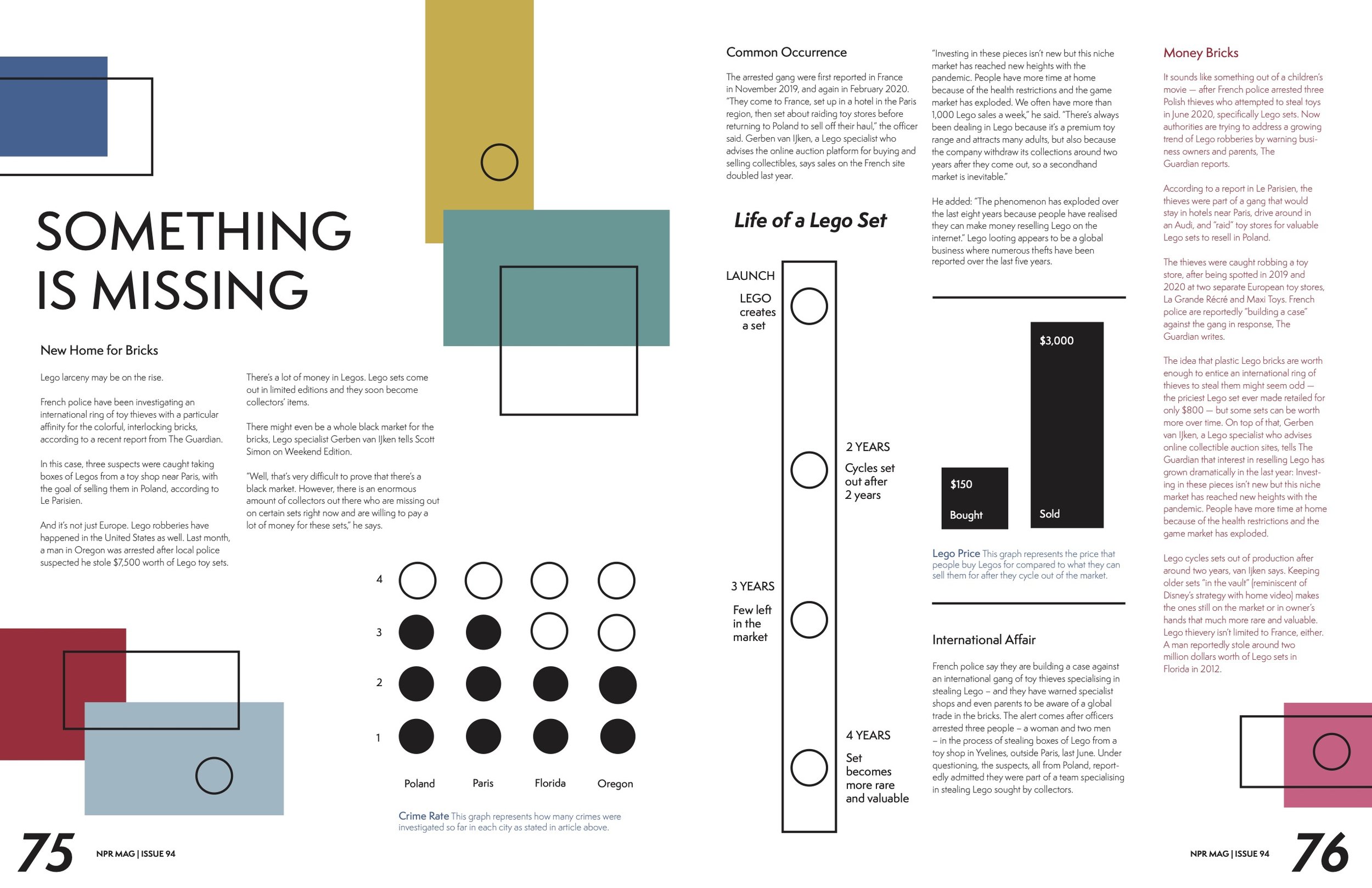
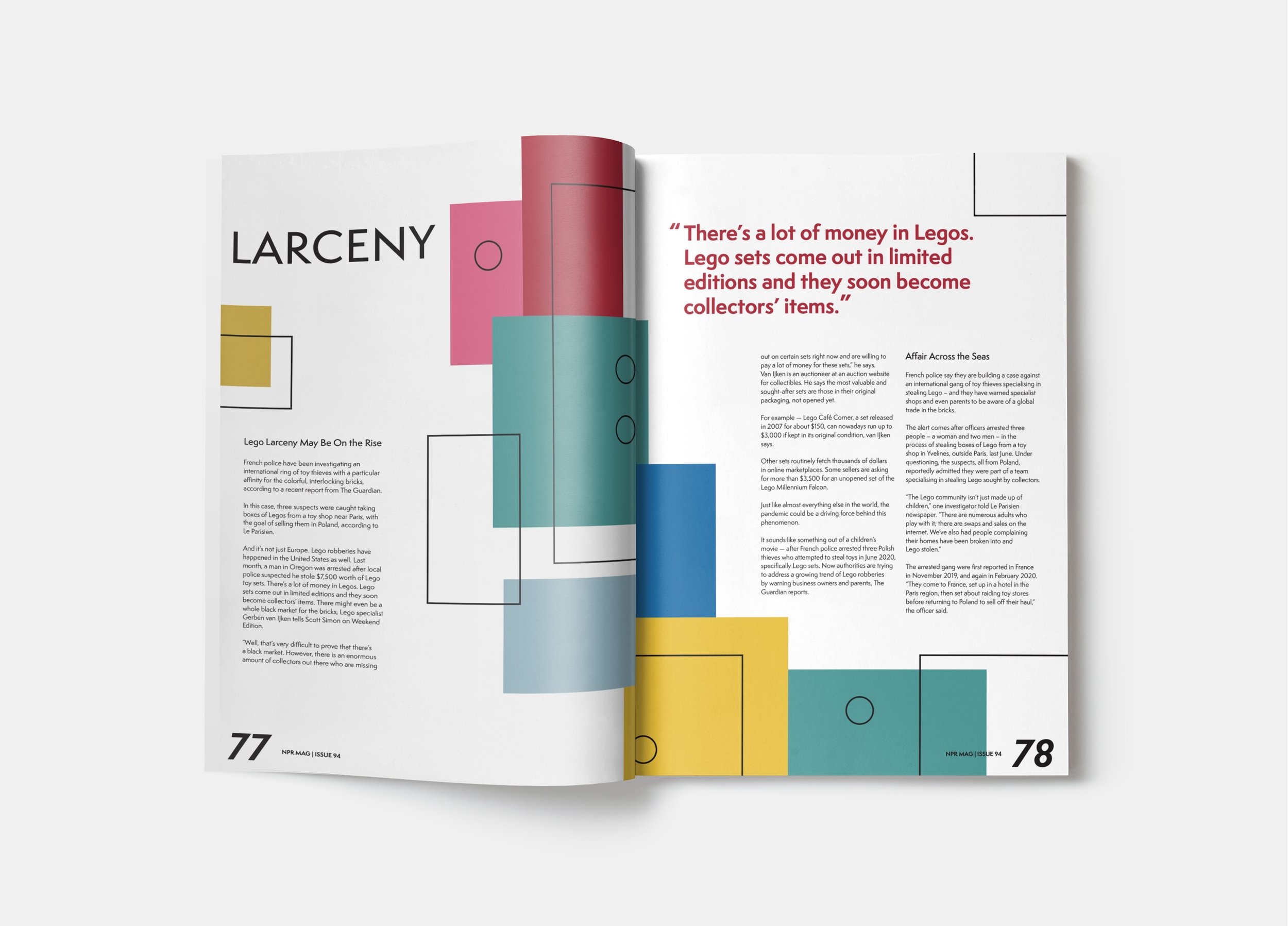
These are my final outcomes I came up with. I wanted to draw close to the lego house and more danish design, but still have a little flare of my own artistic choices.


This is the poster that I designed to be eye-catching, have a call to action, and also be informational.

